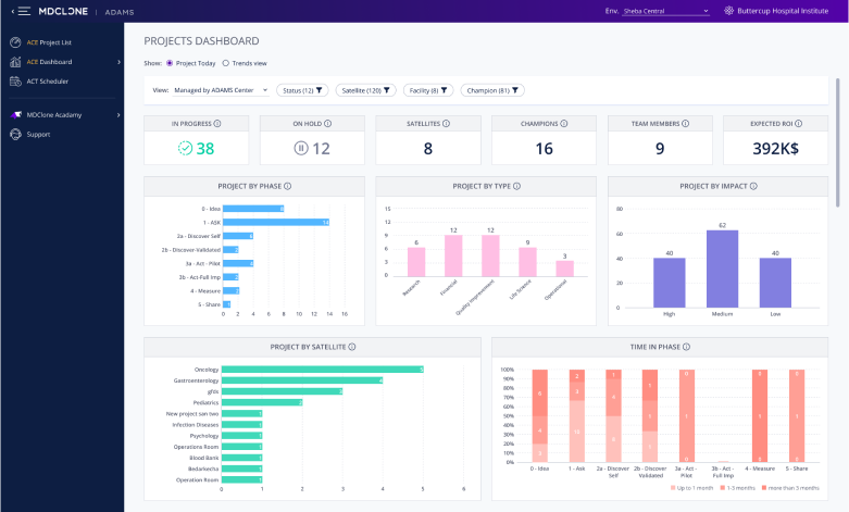
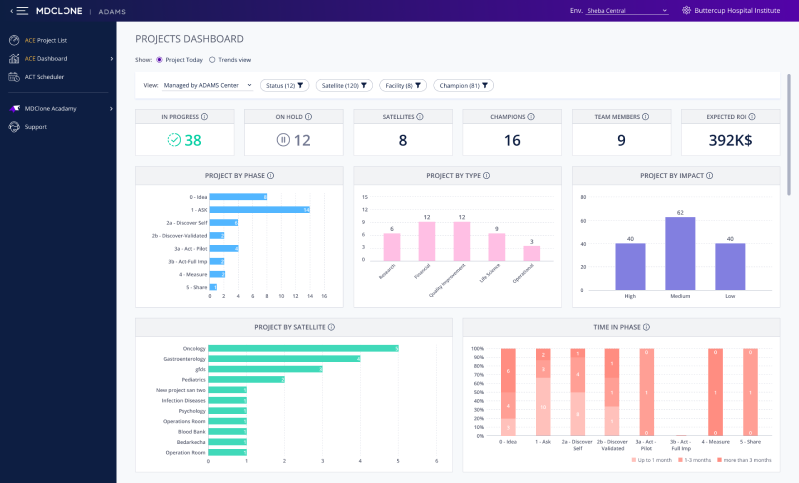
A dashboard enabling executives to manage projects in the ADAMS medical data platform
My Role
UX Designer & Team Leader
The Comany
Medical, B2B, SaaS, Startup
Tools Used
Axure RP, Figma, Excel
The Team
UX Designer, UI Designer
The Process
Empathize
User Intervews
Stakeholder Interviews
Competitor Analysis
Define
Persona Building
Data Visualization Research
Experiment
Wireframe
Validation with Users, PM & Dev
The Wow Factor
UI Design
Iterate
Customer Feedback
Implementing Conclusions
The Challenge
What are we doing here?
Executives are managing dozens, sometimes hundreds of research projects. Their time is scarce, and their resources require careful management.
User & Stakeholder Interviews
Wait, but, why?
The Product Manager provided me with no pain points to speak of, only a feature: a dashboard.
To understand the user & business needs, I conducted interviews with users and internal stakeholders.
I asked them how they were currently using our research project management feature, how they were using other project management software to manage their research projects (if at all), and attempted to determine what additional value this feature can give them.
Insight #1
Don’t Make Me Graph
Users were manually creating graphs and metrics from a csv export of the existing project management table, to use in reports to executives. They were frustrated with repetitively performing a lengthy manual process.
Goal: Remove need for manual, frustrating graphing.
Insight #2
Show Me the Money
Users kept a summary of meaningful everyday metrics like the number of current projects, team members, ROI, and more in their files. They would sum up the numbers manually.
Goal: Show users the metrics they need for everyday work in a front & center manner.
Insight #3
People Have Options
All other project management software that our users were using had dashboard options, and our product looked lacking in comparison.
Goal: Add product value by giving what all our competitors are giving.
Insight #4
Users Have Ideas, Too
One of the executive users illustrated his perfect vision of a visualization, shown below.
Each line represents a single project: the X & Y axes show the project phases (progression) and project priority index, the color of the line represents the project’s impact level (high/medium/low) and the dotted line represents new projects.
Goal: Provide the user with the data he worked so hard to show he needs.
User suggested
Persona Building
Who needs this?
I presented user personas to the team, to summarise the research in an easily digestible manner.
Shir, Administrator
45, Data Project Manager
ADAMS Center Administrator
Engagement Level
Usage Type
Entering and Editing Data
Pain Point
Time is wasted on manually creating executive summaries
Need
Full information regarding research projects
What good is the platform if I have to open Excel every day anyway?
Proficiencies
Technical
8/10
Medical
5/10
Data
10/10
Goals
Minimize bottlenecks
Advance valuable research
Raise researcher autonomy
Refael, Executive
60, Medical Doctor
CEO/CFO/Other C-Suite
Engagement Level
Usage Type
Viewing Only
Pain Point
Too busy to go through the minutiae of the data
Need
Birds’ eye view about research projects
I want to see where we stand, not analyse data.
Proficiencies
Technical
5/10
Medical
9/10
Data
7/10
Goals
Increase profits
Improve patient satisfaction
Improve quality of care
Exploring the data & visualization options
What can we show?
At first, the product management team had a vision:
They planned on creating the table-graph the user had sketched.
I explained why this won’t work:
It’s not scalable
Hard to interpret even at a small scale
No glanceable information
And then, product management insisted we need a single visualization of 4 parameters,
as the user envisioned, so I created an Excel mockup of a sunburst graph:
A mockup of PM’s request
I explained why this won’t work:
It’s not scalable
Hard to interpret even at a small scale
Almost no glanceable information
I got to work, refreshing my knowledge of visualization best practices, such as:
Column
Good for simple comparisons
Good for trends over time
Ineffective with long labels
Pie
Users like it, find it familiar
Shows relation between percentages
Confusing in most circumstances
Funnel
Communicates we’re dealing with a process
Helps identify bottlenecks
Difficult to compare 2 data points
Stacked Column
Shows the contributions of components to the whole
Easy comparison in two dimensions
Increases cognitive load
Finally, I took a deep dive into my sample data sets, and made a suggestion:
Splitting the data into three separate graphs, letting the user get bite-sized data points.
A modest funnel, this graph shows the relative proportion of projects in each phase, hinting at their passage between them through time.
The user should aspire for the graph to be a triangle.
A simple column chart, showing the distribution of projects between the ‘impact’ indices.
After discussions of a combined visualization for them, I chose to discard the ‘priority’ index from the dashboard entirely, as its similarity caused confusion.
A stacked column chart, dividing the projects per phase into groups: newly started the phase (may need onboarding); spending a regular amount of time per phase; and stuck in the current phase for too long (might need help).
This simplified the metric of length of time spent in phase in a way that presents the actual relevant insight (as gleaned from interviews) and not just a number.
Validation with Users, PM & Dev
Is it up to snuff?
I presented a preliminary wireframe to users, as well as internal stakeholders from the product management and development groups.
The users loved it, but product and development had two major hurdles:
Issue #1
Incompatible Graph Library
To track whether projects were advancing in a regular pace through the funnel of project phases, I had recommended...
a funnel graph.
The existing graphs library R&D were using did not support a funnel graph.
Switching graph libraries had a 50% higher effort estimate.
Solution: The funnel was downgraded to a bar chart.
Cons: We lost the inherent sense of a process that a funnel conveys.
Pros: The user’s eye can still quickly scan for the desired triangle shape, and the dev effort was doable.
Issue #2
Historical Data isn’t Logged
The design I had recommended included several charts that compare data trends throughout a selected period (e.g. year).
However, it became apparent that the necessary data wasn’t being logged anywhere.
Solution: The dashboard was split in two.
Part 1 - Only current data
Part 2 - Historical trends, to be implemented at a later date along with the collection of such data
Final design
Work with UI Designer
Design System is King
The beauty of working with an expert UI designer, is their ability to make something out of nothing. In this case, to create a brand new component that was missing from the design system: a proper dashboard filter, and not a drop-down menu - which was the best I’d found in the existing system, and looked completely misplaced. The use is the same, but the look & feel are a world apart.
Lessons Learned
What Has This Experience Taught Me?
Lesson #1
My Users Can Draw...
... but that doesn’t mean they’re designers.
Sketching their thoughts is just another way for users to express their needs. Using these as a design guideline will only limit the usefulness of the design.
Bottom Line: Design for user needs, not wants.
Lesson #2
Alignment is Crucial...
... not only in the design, but also in R&D capabilities.
My vision is most likely grander then what Development can create with the prioritization they are handed, and a crucial part of my role is navigating within this tension.
Bottom Line: Aim for the best, compromise for the possible.
Lesson #3
Usage is the Best Compliment.
Our design partner’s middle management (Sharon persona) stopped using their manual processes. Their executives (Rafael persona) embraced using the module, increasing their commitment to the platform.
At the next monthly feedback session we got dozens of requests for new dashboard features - more filters, views, customization options.
Bottom Line: User engagement is key for improvement.